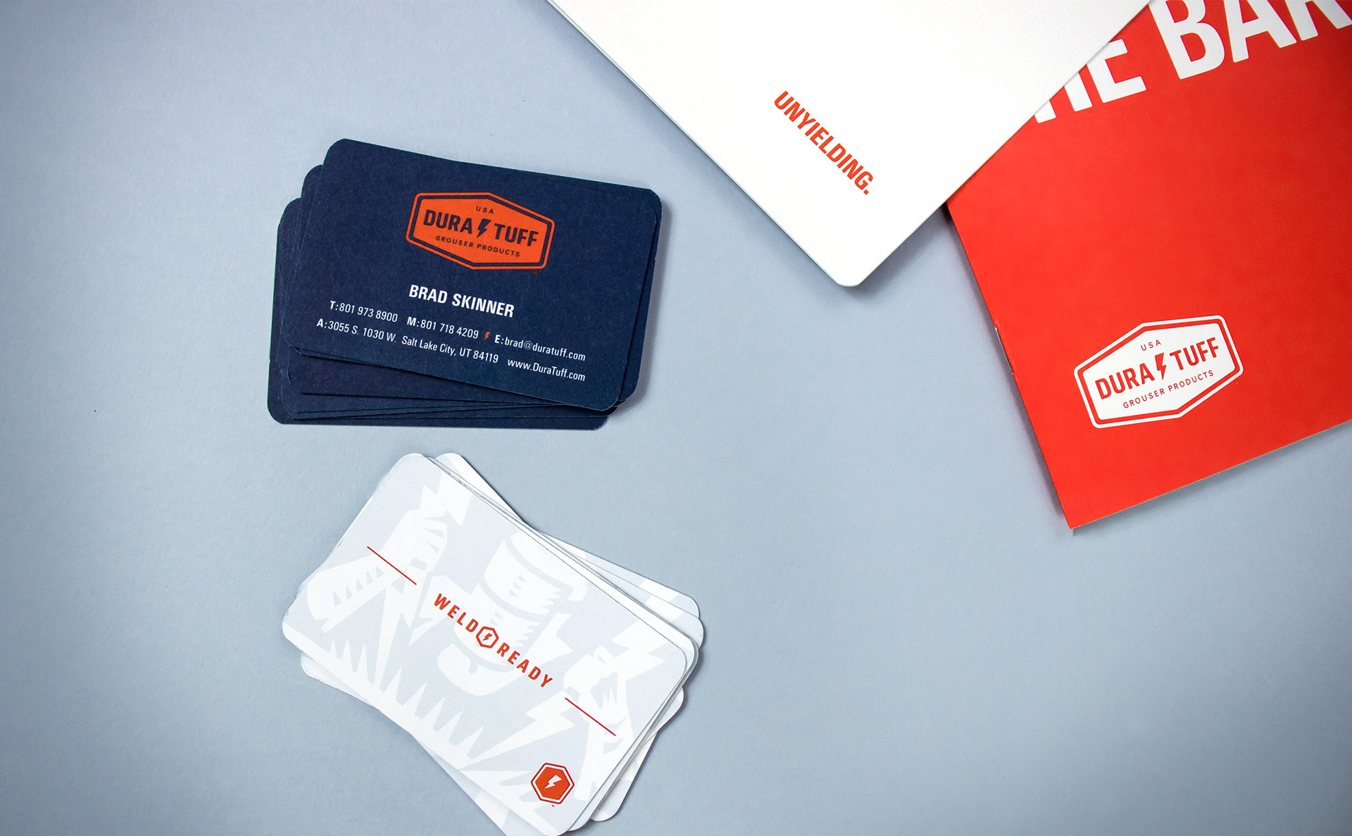
Dura-Tuff
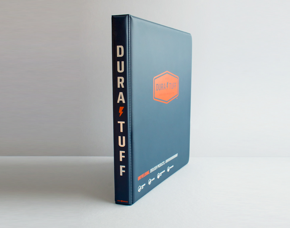
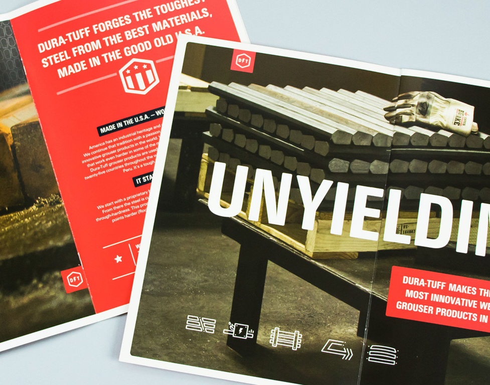
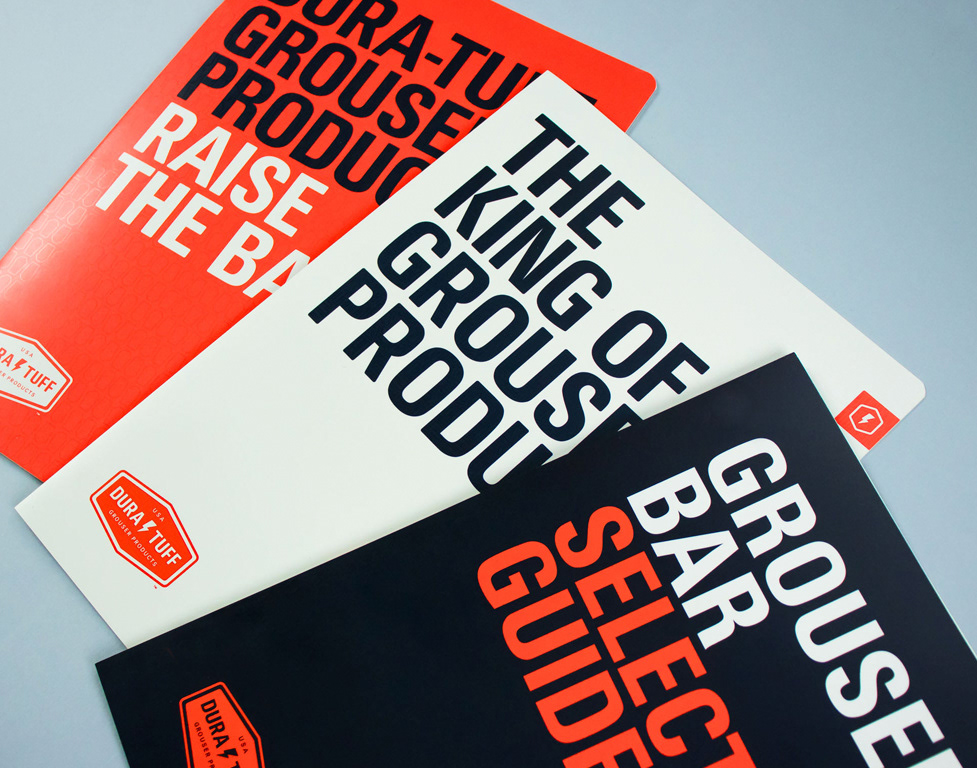
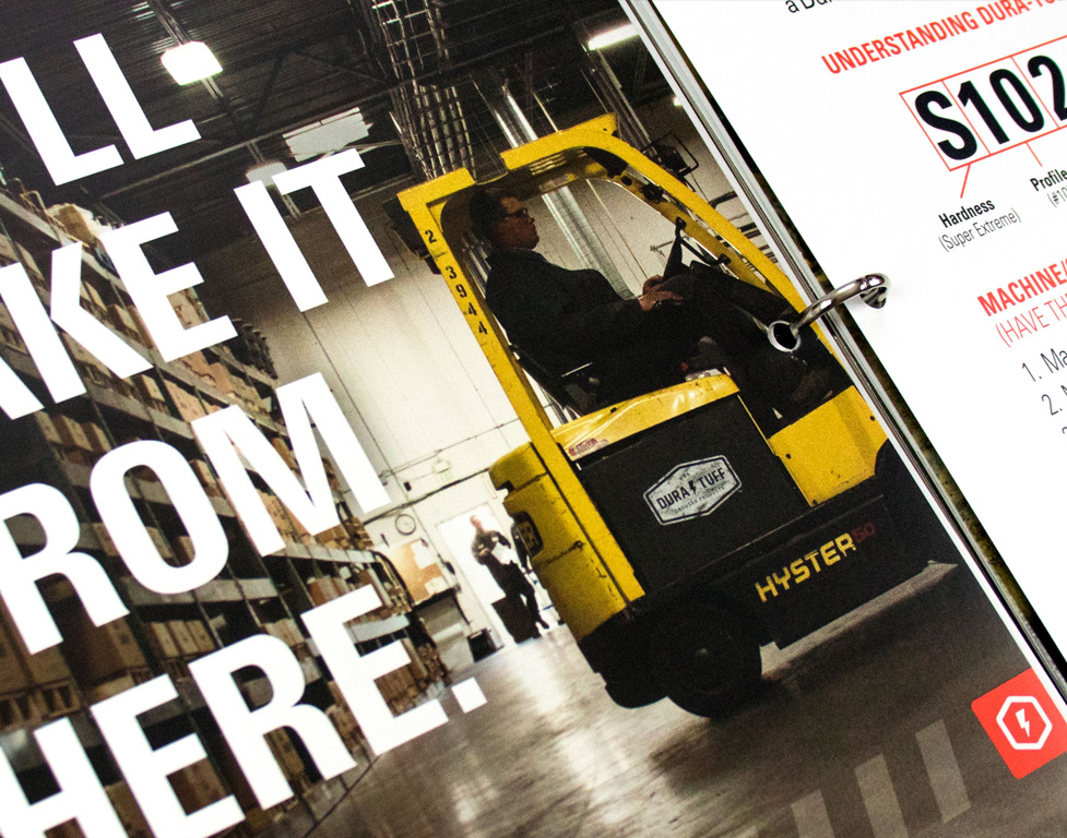
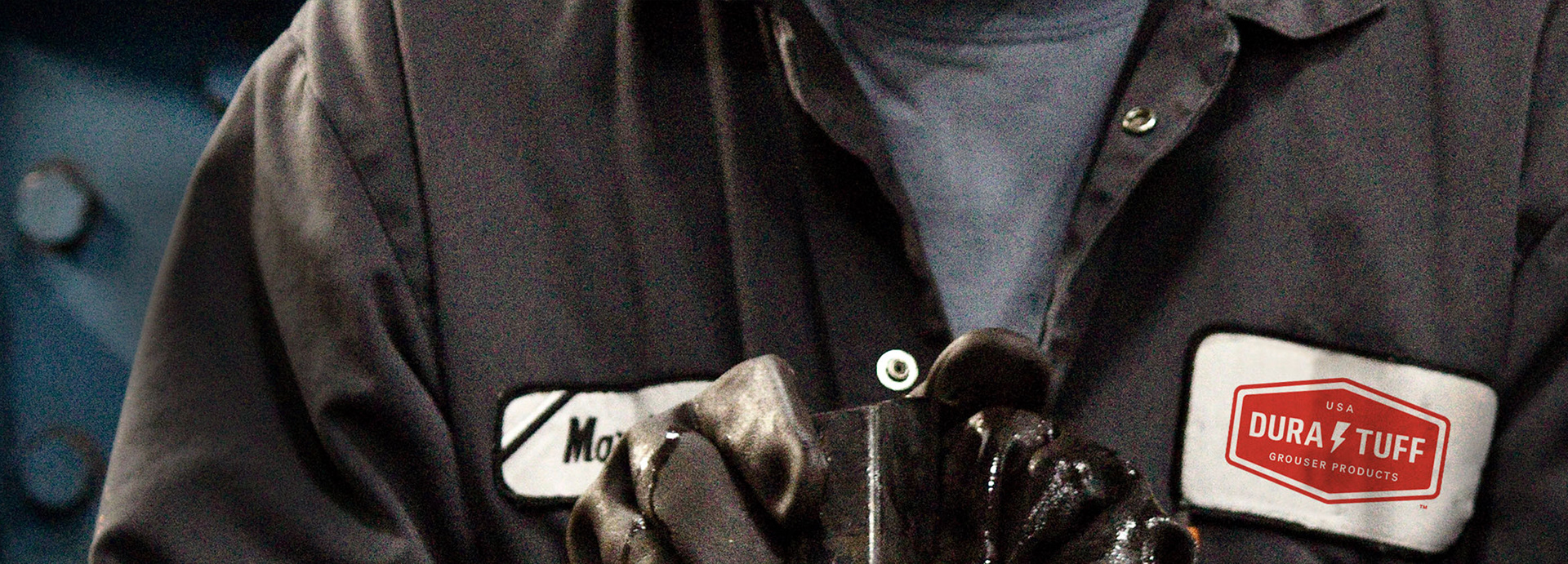
Dura-Tuff makes the toughest grouser products in the world, providing traction for heavy equipment in the the earth-moving industry. They needed a more focused message and visual identity. I designed their new logo, icons, patterns, illustrations, sales kit, catalog, and website.
The new logo and typography feel industrial and hard-working, a symbol of their American industrial heritage and craftsmanship. The bolt infuses the brand with a mysterious sense of myth and legend about lightning-forged steel. Colors are bold and differentiating.
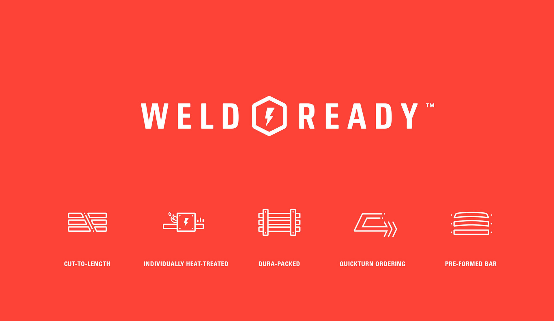
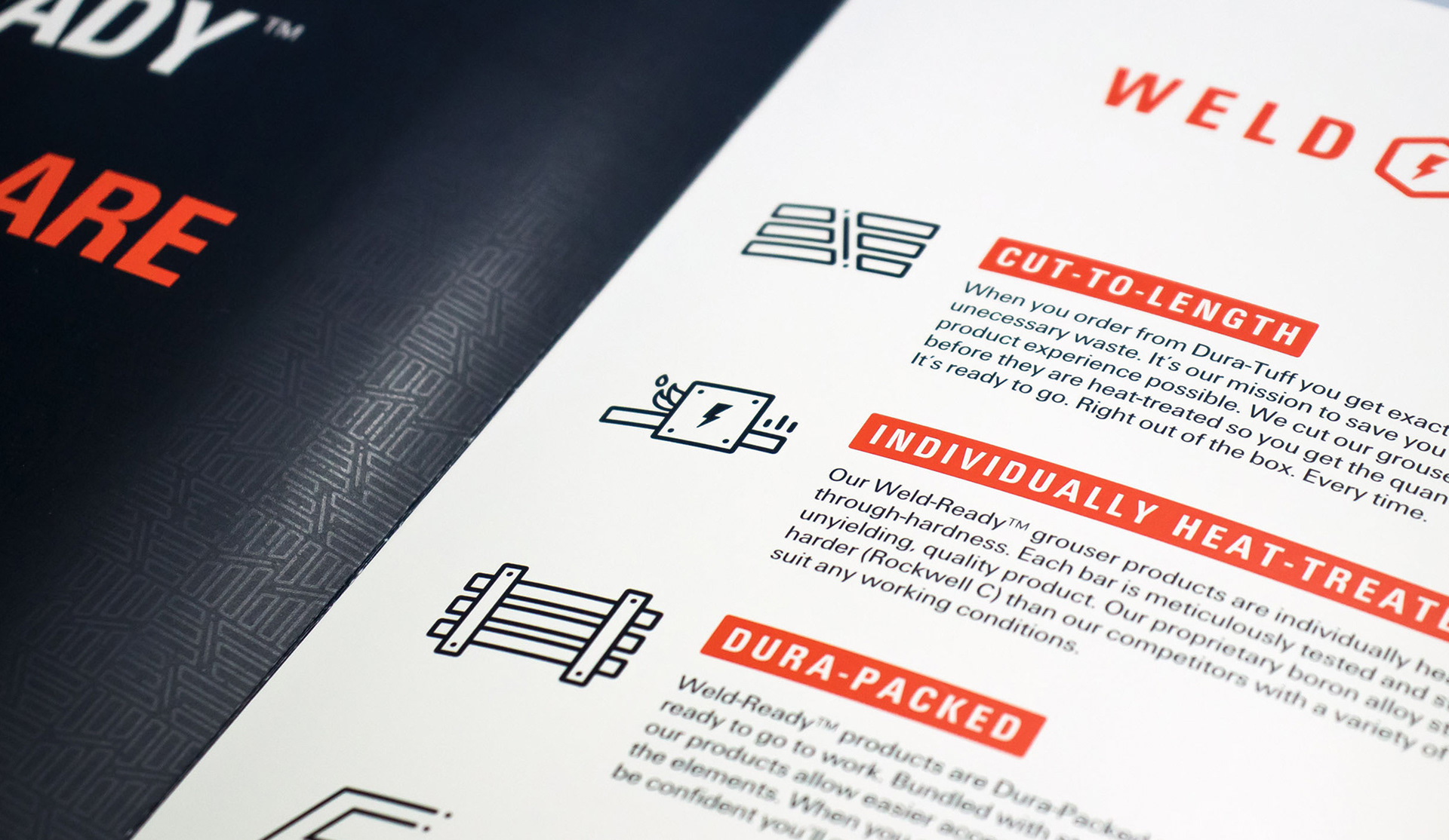
Dura-Tuff's production, packaging, and customer service processes were one of a kind. I helped identify key points of differentiation in their process and developed a messaging strategy under the name Weld-Ready. Icons and patterns are graphic expressions of these unique value points.
Shay was the first creative who consistently delivered what was promised and more. He led us through the process of designing our new identity in an organized and collaborative way.
He consistently brought ideas to the table that accentuated the real value of our services. We are extremely pleased with the results.
—Brad Skinner, Chief Operating Officer, Dura-Tuff, Inc.
—Brad Skinner, Chief Operating Officer, Dura-Tuff, Inc.